When you think of McDonald’s, do you immediately think of its golden arches? McDonald’s logo is so ingrained in its brand that it’s now the embodiment of the brand. That’s the power of a good logo.
As you create your brand and start your roofing business, you must design a logo your company can rally around. This logo will be the face of your company on trucks, signs, magazines, and online.
In other words, your roofing logo needs to be a good one.
If the thought of making a logo for your roofing company sends chills down your spine, don’t sweat it. We’ve compiled the ultimate guide with all the information you need to make the perfect roofing business logo.
We’ll walk you through four essential aspects of crafting a fantastic logo for your roofing company. Along the way, we hope these tips will inspire some roofing logo ideas you can use to brand your company.
Let’s get started!
4 Considerations for Creating the Perfect Roofing Logo
1. Symbol
If you look up “roofing logos” on Google, you’ll see something like this:
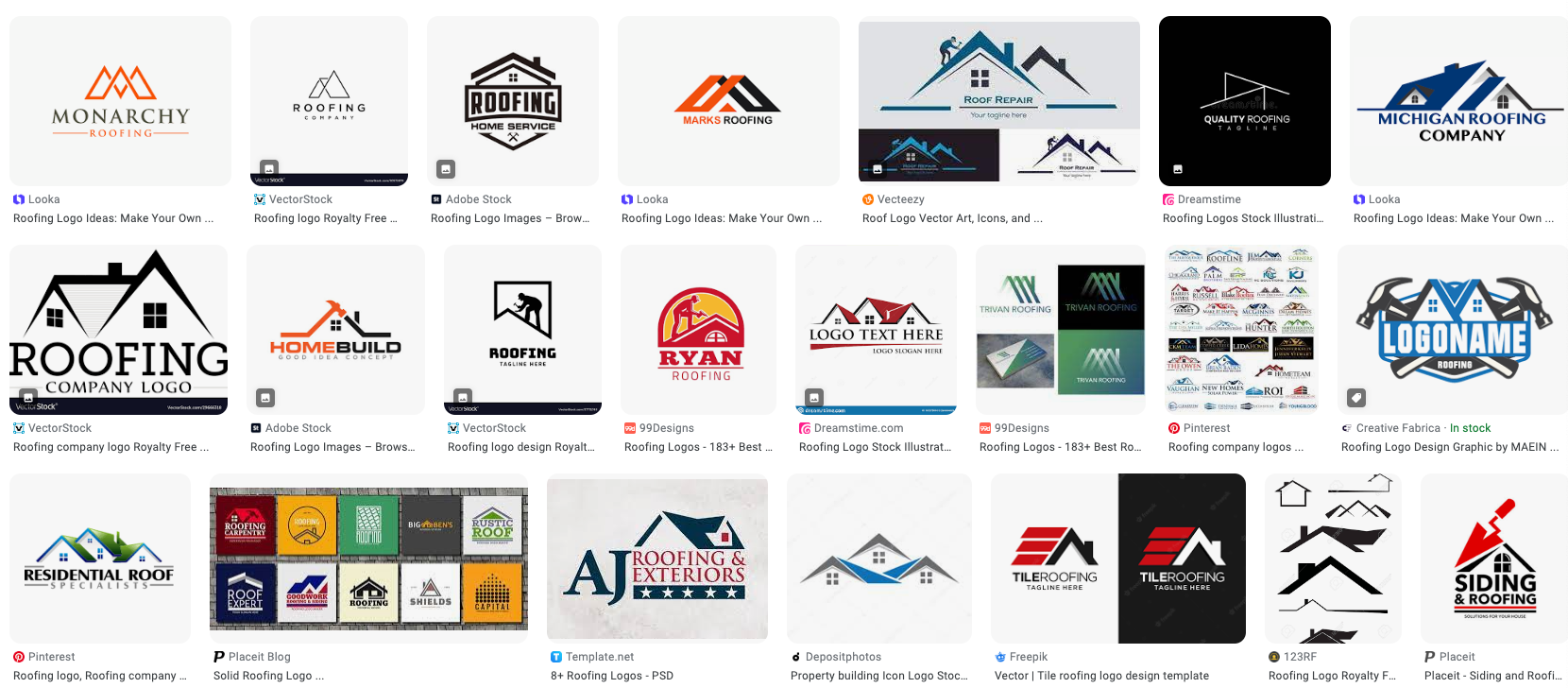
Notice anything in common? If you guessed the symbol of a roof, you’re spot on.
So many roofing companies use a roof symbol in their logo to communicate what their company does. Even if their business name doesn’t include the word “roofing,” you know these companies are roofers because of the image in their logo.
If you decide your logo will have a symbol, you have to be careful about missing symbol pitfalls. Here are some dos and don’ts to help you design your roofing symbol.
- Do make it clear what the symbol is
- Do design or incorporate your symbol in a unique way
- Don’t make your symbol too detailed
- Don’t use a symbol that doesn’t pertain to your roofing business
- Don’t use a generic roof symbol that could be confused with another company
As common as symbols are for roof company logos, you don’t have to have one.
You can still have a great logo without any image or symbol, called wordmark logos. These word-centric logos depend on typography (more on that to come) to help their brand stand out. Check out this insider guide to what makes a great text logo to get some inspiration for your roofing business.
2. Color
Many roofing companies pull their brand colors from nature: blue, orange, green, brown, and gray. It makes sense since roofers work outdoors and their roofs protect customers from natural causes.
But there’s more to picking brand colors than what you like or what feels good. Before selecting colors to represent your roofing company, you should consider color theory and color psychology.
Color Theory
If you’ve ever seen a color wheel, you have some experience with color theory.
This theory provides basic guidelines about which colors work well together (and, more importantly, which combinations to avoid). Colors that are visually pleasing when grouped have color harmony.
Here’s a quick refresher on color harmony standards.
- Analogous colors: 3 colors that are next to each other on the color wheel
- Complementary colors: 2 colors that are across from each other on the color wheel
- Combinations found in nature: Colors that don’t fit into a set pattern but are together in a natural setting (flower, beach, etc.)

Color Psychology
Colors themselves can send a message to your customers, and it’s your job to send the right message about your brand. Looking at color psychology can help you dial in your message and even improve your sense of authority.
The trick with color psychology is that some color associations are cultural. For example, people associate mourning with the color black (U.S.), white (China), yellow (Ethiopia), red (South Africa), and purple (Brazil).
Check out this guide to the psychological effects of color to see each color’s possible meaning or emotion.
With all this information in mind, you’re probably wondering what colors you should use. Luckily, the internet has several color palette generators to help you make a cohesive, attractive set of brand colors. We recommend using Coolors, Muzli Colors, or Khroma for free.
One last thought about color: all roofing companies should have a black-and-white version of their logo. There are rare cases where having a colored logo doesn’t work or make sense. You can’t depend solely on color to identify your brand in those situations.
3. Font
Roofing company logos aren’t complete without a proper font. The font (called typography or typeface in design) showcases the most important part of your logo: your business name. If someone can’t tell your company’s name by looking at your logo, it’s time for a different font.
You can find millions of different font styles, but they fall into a few general categories: serif, sans serif, script, and decorative. Let’s take a quick look at each of those groups.
Serif
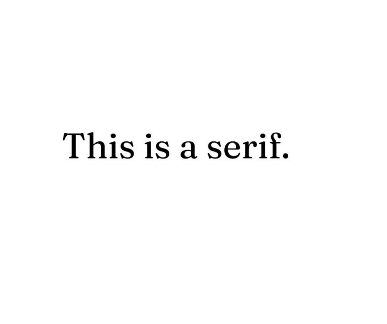
Serif fonts have a little defining tab at the end of each letter. Those tabs are called serifs, thus the name of the typeface. Slab serif fonts, a subtype of serif, have a more pronounced tab. Serif typefaces exude a sense of tradition, professionalism, and credibility.
Sans Serif
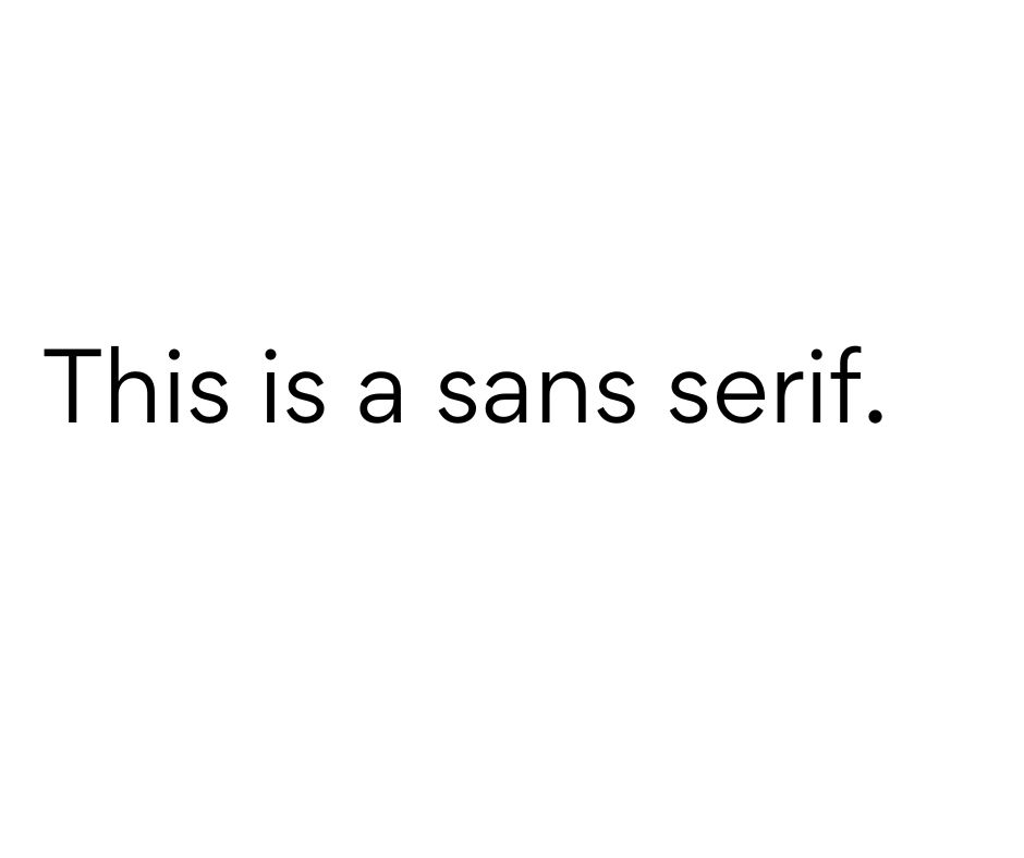
“Sans” means “without” in French, so a sans-serif typeface does not have serif tabs. Sans serif was developed long after the serif typeface, which gives it a more modern appearance. This typography also feels more casual, clean, and inviting.
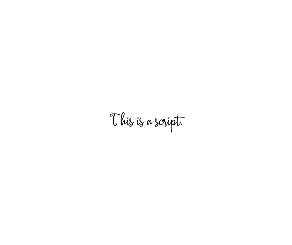
Script
Script typography is inspired by calligraphy and cursive handwriting. These fonts foster feelings of uniqueness, elegance, and personalization. Depending on the particular font, it might also seem more feminine.
A word of warning about using script fonts: they can be hard to read. Focus on legibility if you want a script font in your roofing logo.
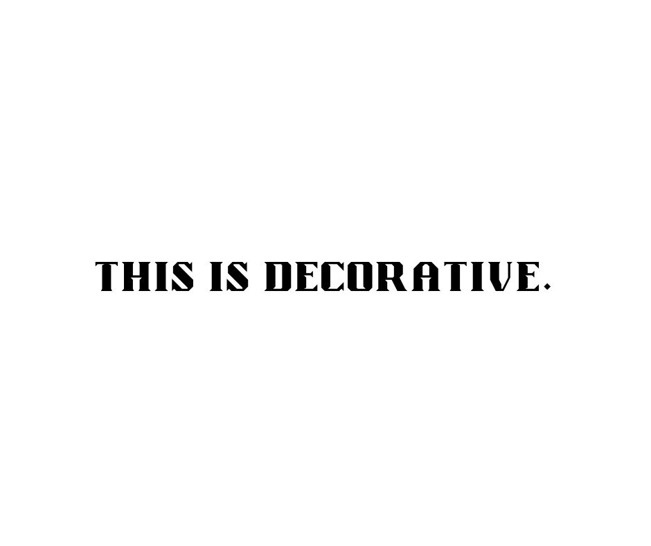
Decorative
Decorative typefaces are a subset of the other three types but have more flair. You might be familiar with Papyrus, Playbill, and Curlz decorative fonts. These font types are great in moderation since they indicate creativity, but beware of overusing them.
When you’re picking the typeface for your roof company logo, keep it related to your brand and easy to read.
You can use multiple fonts in your logo if you’re feeling adventurous. Mixing different types of fonts can be stylish, professional, and eye-catching. But limit yourself to three fonts or less to prevent visual confusion.
4. Slogan
Let’s be clear. Roofing logos don’t have to include a slogan, but they can. Slogans and taglines are zippy one-liners that hook people in. Going back to our McDonald’s example, “I’m lovin’ it” makes you think about loving their food.
If your roofing business centers around one statement (like a company mission or vision), a logo is an excellent place to put it. Your slogan could also be your unique selling proposition.
If you want a slogan in your roofing logo, make sure it doesn’t detract from your company name. This generic food truck logo not only incorporates a slogan well, but it also effectively uses two different font styles!

How to Make Your Roofing Company Logo
Now that you know these four logo principles, all that’s left to do is craft your personal logo. You have three options for how to go about doing this: make it yourself, use a generator, or have a professional make it.
Let’s go over the pros and cons of each.
Make Your Roofing Logo Yourself
Even if you don’t think of yourself as creative, you can roll up your sleeves and make your roofing company logo.
- Pros: You get to let your creativity flow and bring your vision to life.
- Cons: A lack of experience or design know-how can slow down the process or not give you the results you want.
Use a Logo Generator
The internet has countless logo generators like Brandcrowd, Looka, and GraphicSprings. Some, like Wix and Canva, are even free to use.
- Pros: The generator does most of the work for you, so you save time.
- Cons: You still have to personalize the generated logo, and there’s a chance other companies will use the same roofing logo.
Let a Designer Build Your Logo
Professionals have the background and skills to make a logo that perfectly represents your roofing business. Designers will often ask you what you’re looking for and learn about your company to get a suitable logo.
- Pros: You get a high-quality logo unique to your business, and the designer will do all the work, so you just have to approve the design.
- Cons: Personalized work requires a personalized fee, which makes a professionally designed logo more expensive than the other options.
We recommend using a logo generator to come up with some roofing logo ideas. Figure out what you like and the overall design look you’re going for. Then either try your hand at making it yourself or send it to a designer.
That said, you know what option would work best for your business. If someone on your team has design experience, they might be able to craft your logo for you. But if you don’t have time or any interest in it, you don’t have to take it on yourself. Do what’s right for you.
Craft Your Logo, Craft Your Destiny
If you’re ready to break into the roofing industry, don’t let making a logo hold you back. You know the four elements of solid roof company logos and three ways to go about making one for your business.
Once you have your logo, the next step is to make a roofing website. Check out our post about how to make a website for your company so you can set your roofing business up for success!
What are you looking for in your roofing logo? We’d love to help get the right look for your business.

